Romanica, by Romanica, is a classic serif typeface that brings historical Roman lettering and subtle calligraphic details to desktop typography. It targets designers who need a formal, antique voice for display work and favors legibility in headings and title treatments. The font suits graphic designers, typographers, hobbyist creators, and desktop publishers producing posters, invitations, or book covers across print and screen projects.
What Romanica does to document hierarchy
Romanica shifts emphasis toward formal display text by offering a serif voice with calligraphic touches, intended for titles and prominent text rather than dense body copy. The design preserves a measured contrast and historical letterforms, so designers use it where a preserved, old-world tone is required instead of neutral text faces.
How much typographic control it actually provides
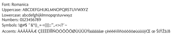
The font supplies core glyph coverage for display layouts: a complete alphanumeric set with uppercase and lowercase letters, standard numerical digits, and basic punctuation. The package comes as a TrueType font file, and the supplied materials do not list alternate stylistic sets or multiple weights, so typographic variations beyond the single file are limited by the provided release.
Is it simple to install and fit into workflows?
Installation follows a standard TrueType workflow and supports common platforms. After extracting the .ttf from the download, right-clicking the file and selecting Install registers the face with the system, which makes it available in desktop design applications. The font lists compatibility with Windows, macOS, and Linux, so it integrates into cross-platform editorial and print workflows.
Practical recommendation for designers
Romanica is a focused choice for designers who need a restrained historical serif for display work; reserve it for titles, covers, and printed invitations. Before deployment, inspect the included readme for extended-character coverage and licensing, and pair Romanica with a neutral sans for body copy to maintain legibility across projects.
Pros
Complete uppercase and lowercase glyph set for display typography
Provided as a TrueType (.ttf) file for broad application compatibility
Distinctive serif with calligraphic flourishes suitable for formal headings
Designed by Dieter Steffmann, experienced in historical type digitization
Cons
Extended multilingual character support may be limited in some versions
No alternate weights or stylistic sets listed in the provided materials
Optimized for headings rather than small-size body text
Laws concerning the use of this software vary from country to country. We do not encourage or condone the use of this program if it is in violation of these laws. Softonic may receive a referral fee if you click or buy any of the products featured here.